Logo | Menus | Packaging | Apparel | Illustrations | Marketing Materials | Copywriting
Black Eyed Suzie's
Black eyed suzie’s is a bold, buzzing bel air restaurant and bar — serving up top-tier food, craft cocktails, and a packed calendar of live music and events. It’s where locals go to cut loose, feel at home, and experience a friendly, unforgettable hospitality vibe. As a restaurant branding project, this work showcases strong visual design that captures the spirit of community and nightlife in maryland.


The Challenge
Black Eyed Suzie’s needed a brand refresh—not a full reinvention. Their identity was all over the place, with logos and visuals that didn’t match the laid-back vibe regulars loved. The goal: tighten things up, bring consistency, and give the brand a fresh look that still felt like home.
The Strategy
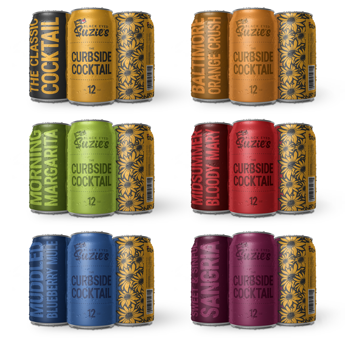
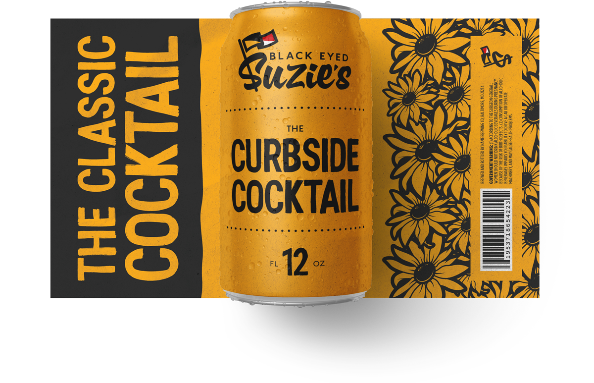
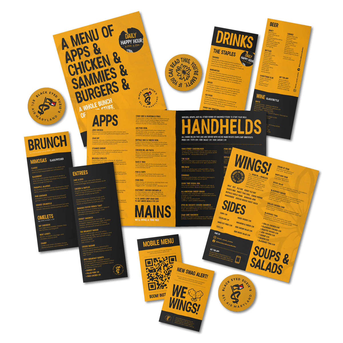
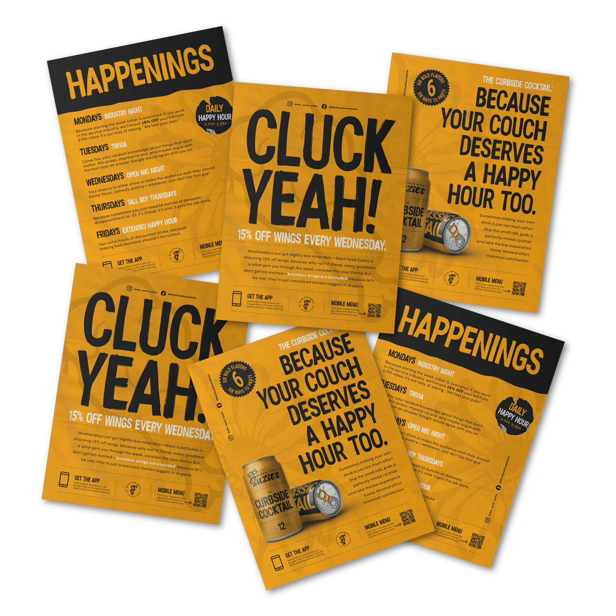
When rebranding Black Eyed Suzie’s, the goal was to create a look that felt like a natural evolution, fresh but familiar. The old brand leaned heavily on stark white menus and scattered Maryland flag motifs, resulting in a disjointed feel. I simplified things by stripping the flag down to its essence: the colors. Instead of using the flag’s design, I pulled its most recognizable elements: yellow, black, and just a hint of red and white. The result was a bold, ownable palette that felt unmistakably local without being cliché. It stood out, felt intentional, and finally matched the energy and attitude of Suzie’s.
The Outcome
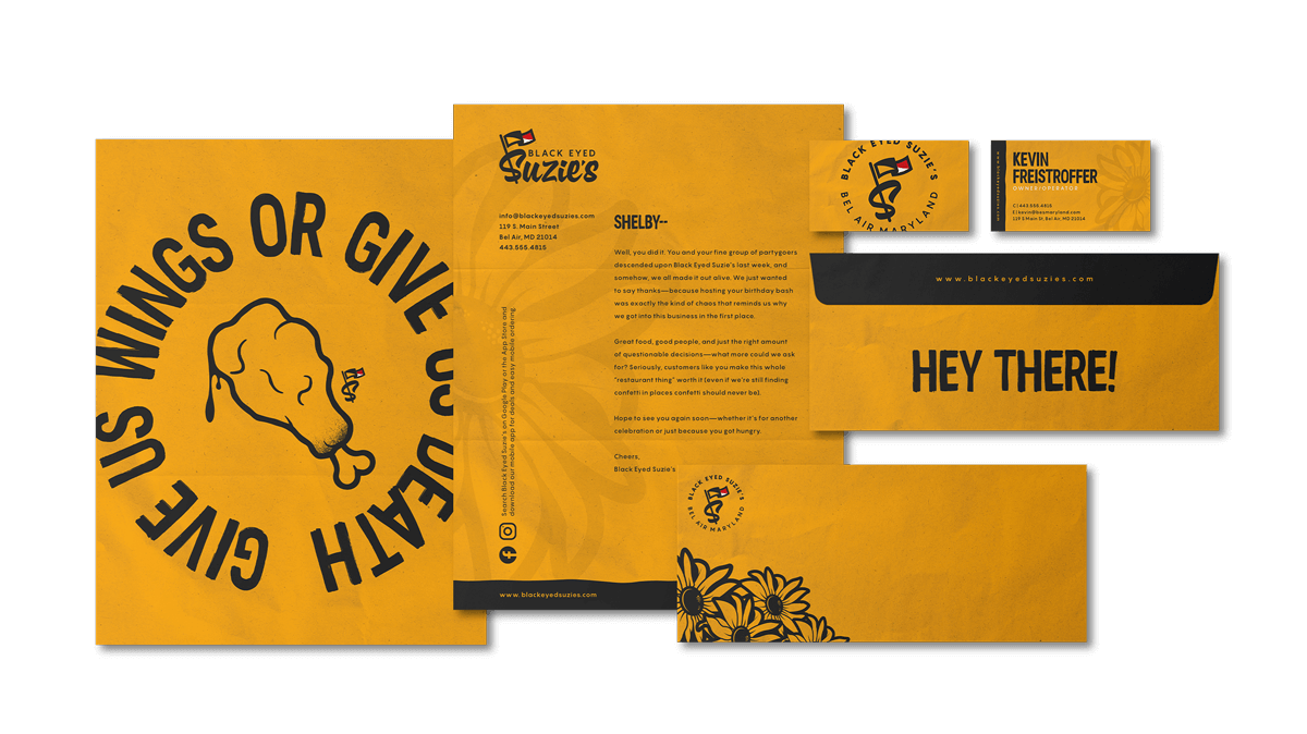
The refreshed Black Eyed Suzie’s brand carried its bold and direct attitude across every touchpoint, perfectly matching the restaurant’s laid-back yet lively atmosphere and diverse clientele. This cohesive new identity was brought to life through redesigned menus, eye-catching in-store marketing materials, and stylish apparel that resonated with regulars and newcomers alike. Even the canned cocktails embraced the updated look, tying the entire brand experience together with confidence and local flair. The result was a consistent, memorable presence that felt authentic to Suzie’s spirit and energized its connection with the community.