Brand Identity | Ad Campaign | Apparel | Packaging | Social Assets
ONGUARD PROTECTIVE WORKWEAR
Onguard protective workwear is a sister company to dunlop protective footwear, one of the most recognized brands in its industry. Onguard manufactures extremely durable workwear, including jackets, boots, overalls, chemical protective gear, shirts, and pants built for people who work hard for a living. The brand is known for its quality, ruggedness, reliability, and professional edge, delivering gear that performs in demanding environments without compromise.

THE CHALLENGE
As a sister brand to a global powerhouse like Dunlop, the challenge was balance. Onguard needed to feel undeniably part of the Dunlop family without becoming a visual echo or losing its own identity. The question was whether to fully adopt Dunlop’s red and black palette or develop a system that could stand on its own while pairing seamlessly in cross-marketing efforts. The brand had to project strength, durability, and trust while maintaining a polished, professional presence. This was especially critical in a crowded market dominated by heavy hitters like Carhartt, Timberland PRO, CAT, Dickies, Wrangler, and other workwear staples fighting for attention on the same shelves.
THE STRATEGY
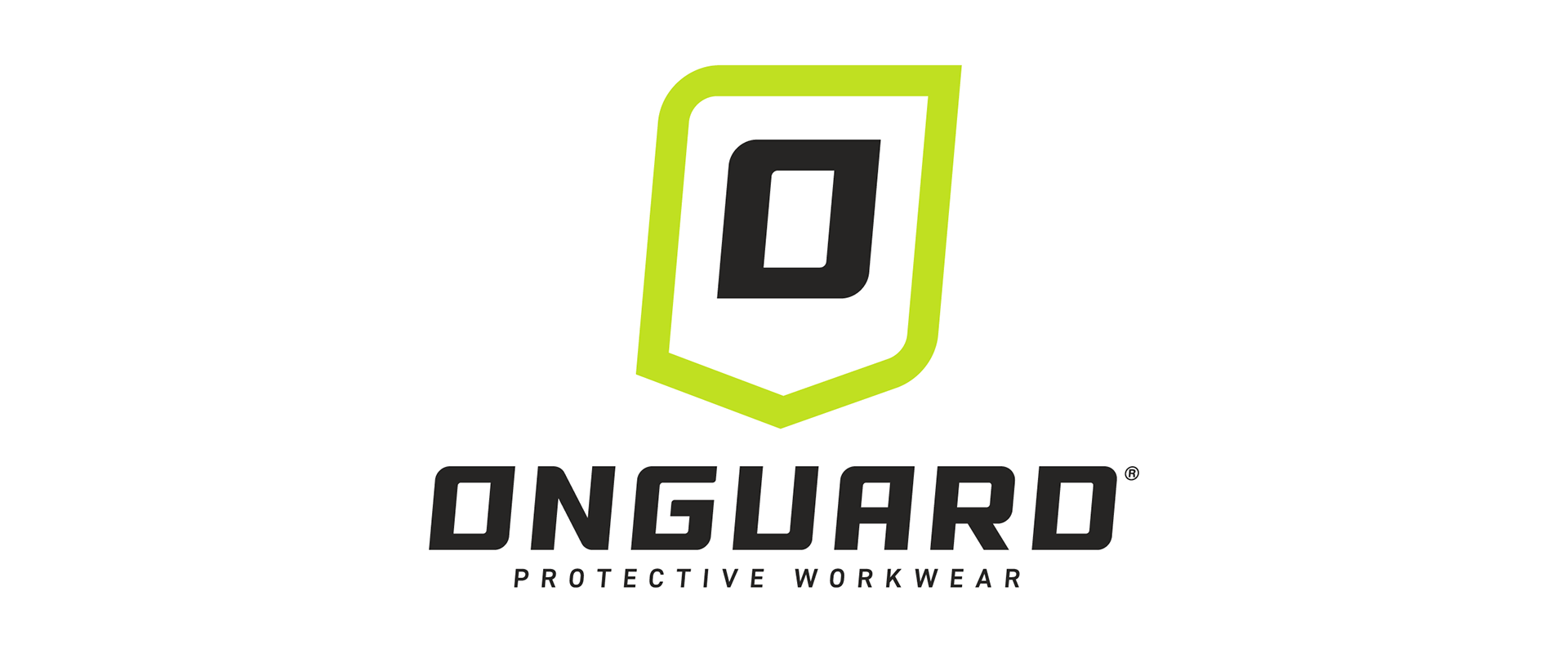
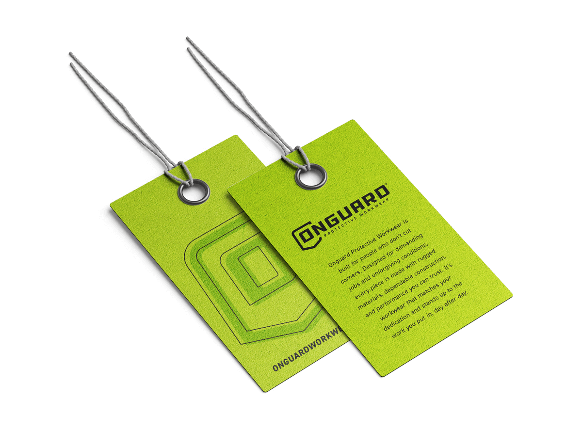
The process began by clearly defining who Onguard is and what it stands for. The existing logo featured a black and yellow shield within a shield, a concept that aligned well with protection but lacked immediate impact. While not a requirement, retaining the shield felt like the right foundation to build from and evolve. Color was a critical decision. With Dunlop firmly rooted in red and black, the goal was to find a palette that complemented rather than competed. After extensive exploration and side-by-side testing, a bold green was selected. It set Onguard apart from competitor brands that lean heavily into red, yellow, and orange, while pairing naturally with Dunlop in cross-brand applications. The result was a system that felt cohesive, intentional, and distinct.
THE OUTCOME
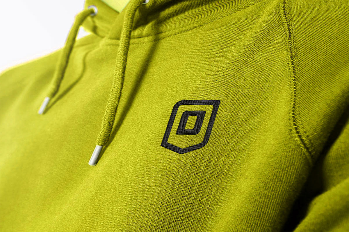
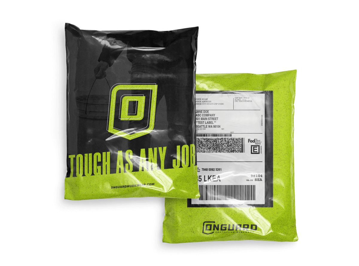
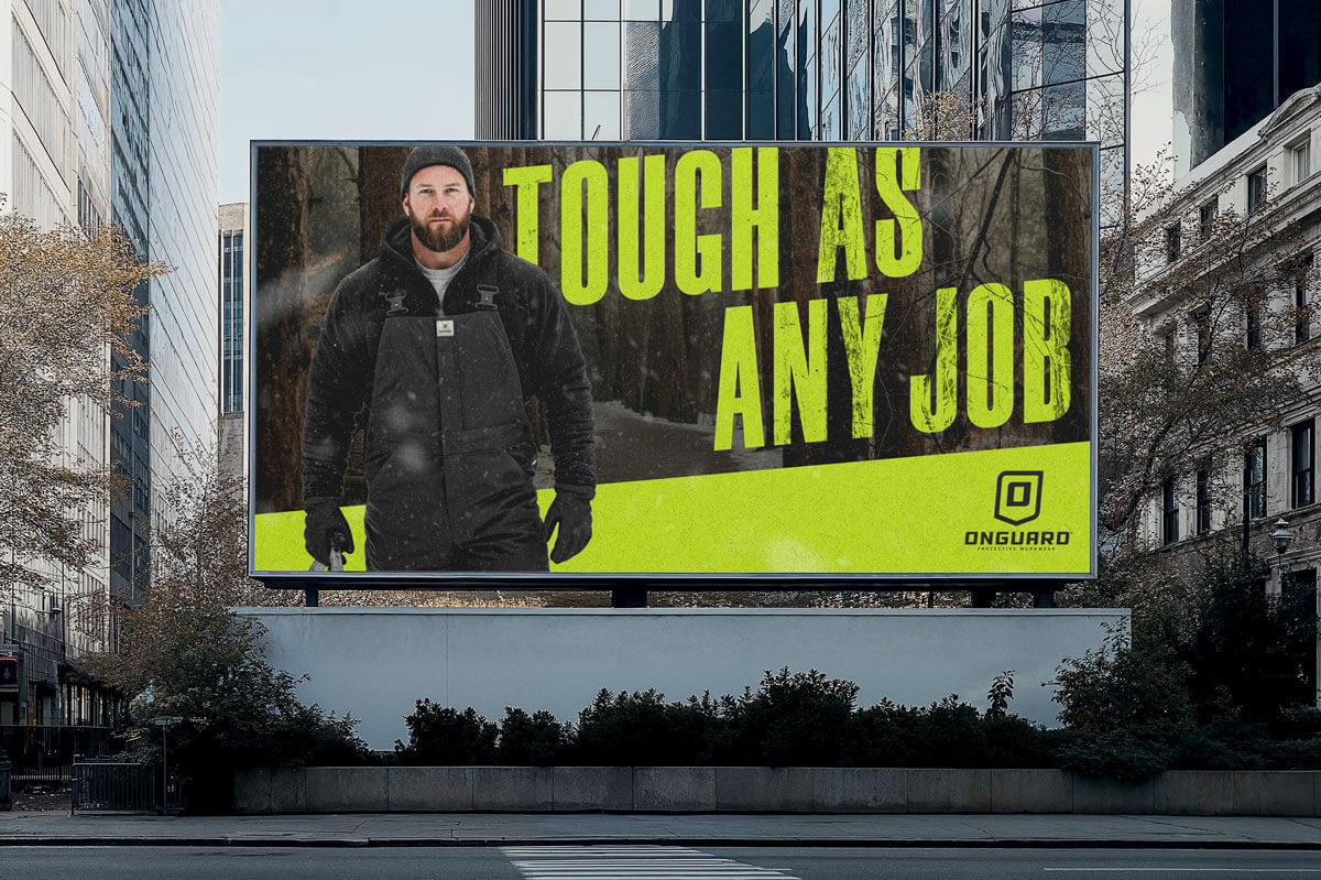
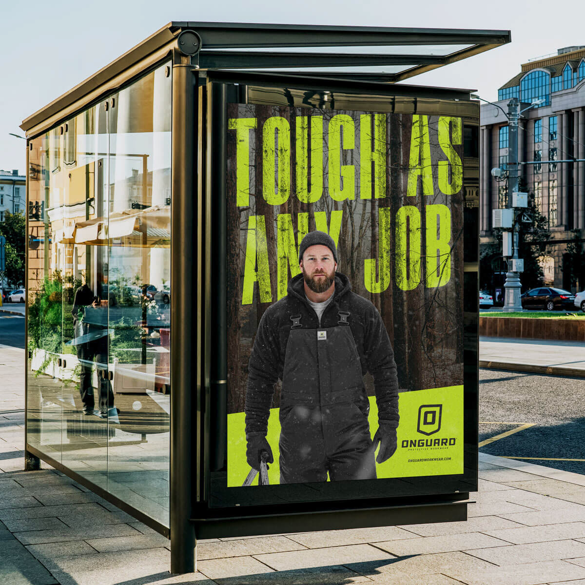
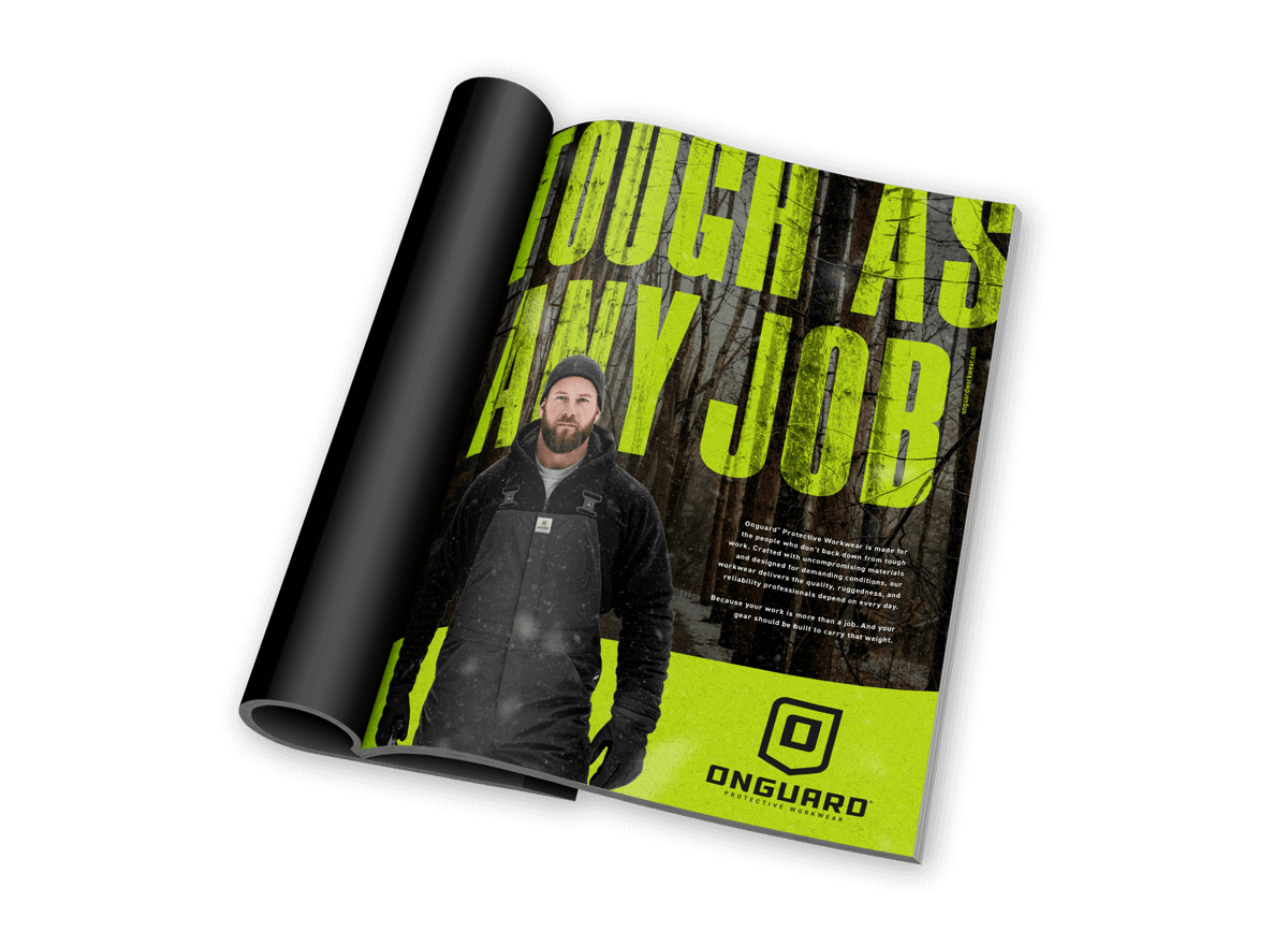
The rebrand was met with strong internal alignment and minimal revision, a rare outcome in corporate branding. Anchored by the tagline “Tough as Any Job,” the brand came together with clarity and confidence. A stronger, more prominent shield became the centerpiece, featuring an “O” at its core to symbolize strength, reliability, and protection. The slight forward angle nodded to the legacy mark while pushing it into a more modern, assertive space. The custom Onguard wordmark was designed to mirror that same angle, reinforcing momentum, progress, and the company’s commitment to evolving alongside its customers. The final system is gritty, bold, and unapologetically tough. Angled holding shapes, high-contrast layouts, and field-driven imagery spotlight real people doing real work, with Onguard positioned as the brand that has their back in the trenches, day in and day out.
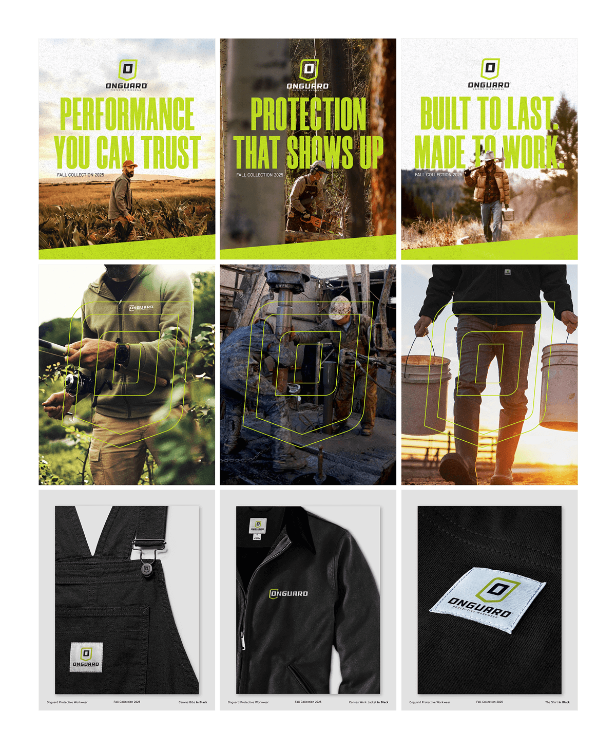
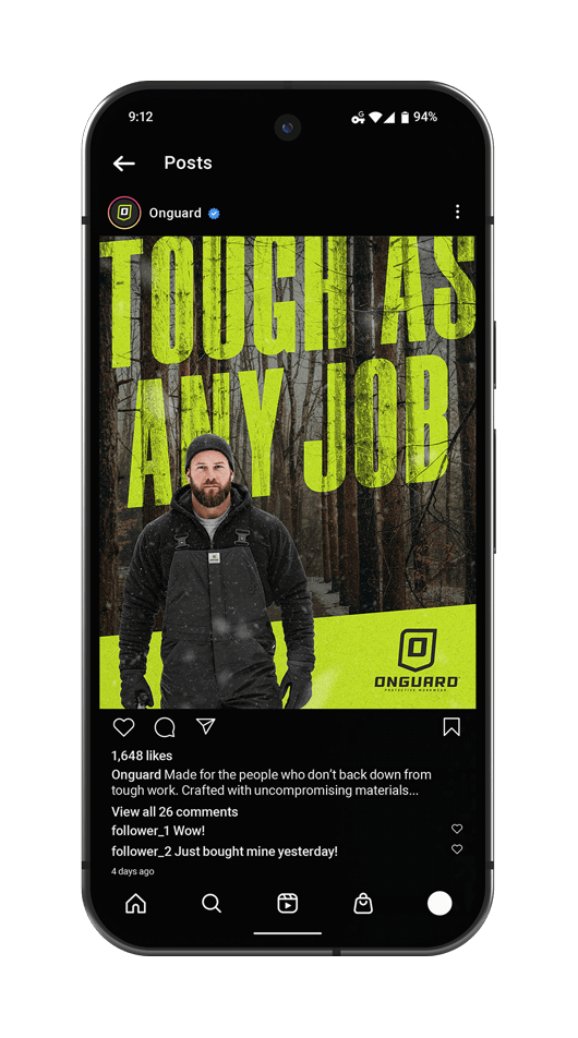
TAKING THE BRAND INTO THE WORLD
The campaign was anchored by the tagline “Tough As Any Job,” a statement that clearly defines Onguard’s mission and promise. It speaks directly to the reality of blue-collar work, where conditions are unpredictable, environments are unforgiving, and gear must perform without question. The imagery reinforces that message by placing Onguard on a working man in the field, layered in multiple products that protect him both from the demands of the job and the elements around him. The oversized headline lives boldly in the background while the brand mark cuts through the composition, ensuring both the message and the name stand strong. Together, the campaign positions Onguard as more than workwear—it’s a dependable extension of the worker’s grit, built to meet the same level of toughness they bring to every job.
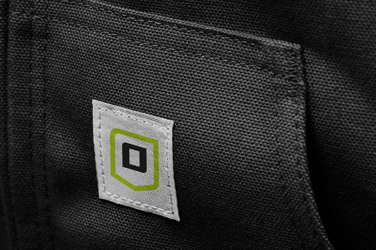
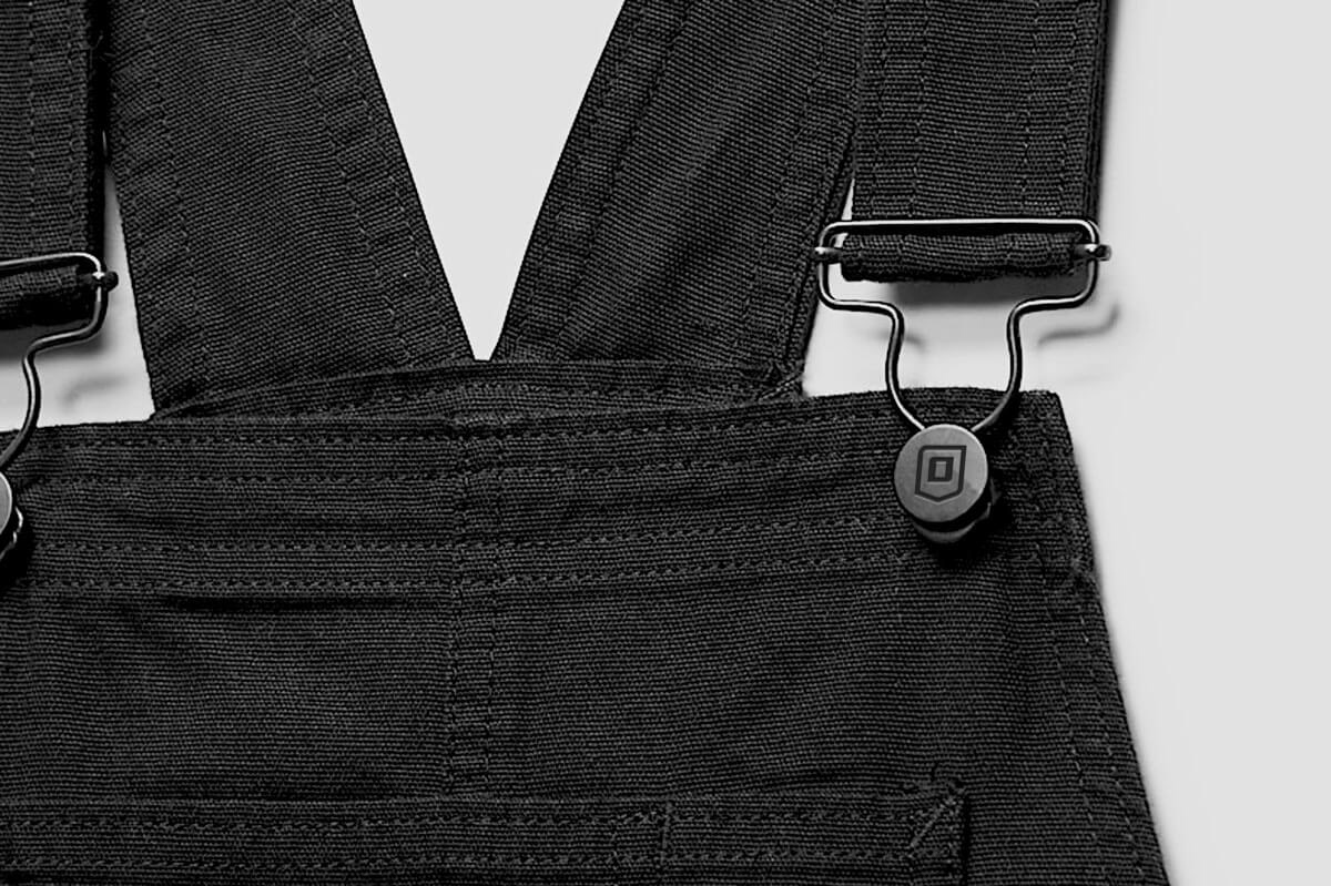
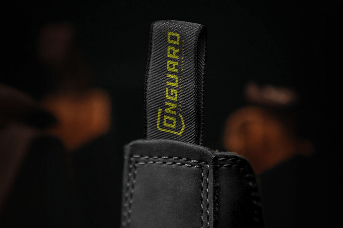
TURNING SCROLLS INTO RECOGNITION
Social content was designed to balance product recognition with real-world credibility. Organic posts focused on simplicity and consistency, allowing the product to do the heavy lifting. Three close-up product shots highlight material quality, construction, and branded details to drive recognition and trust. Three additional posts place Onguard in action, worn by blue-collar workers in real working environments. These posts feature a large outlined brand mark to clearly connect the work back to the brand and reinforce Onguard’s role in supporting the labor behind it. Paid social shifted the approach into full campaign territory, led by the “Tough As Any Job” hero ad and supported by two message-forward executions designed to stop the scroll and encourage consumers to learn more about the product line. Together, the content creates a cohesive social presence that builds awareness, credibility, and intent.