Logo | Menus | Marketing Materials | Copywriting
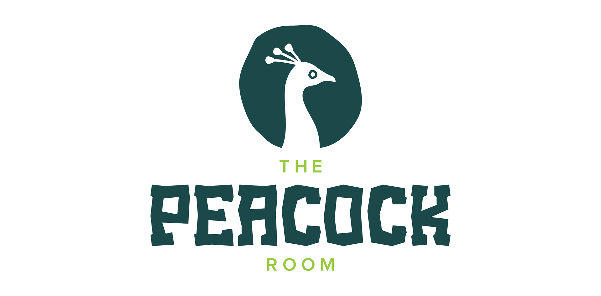
The Peacock Room
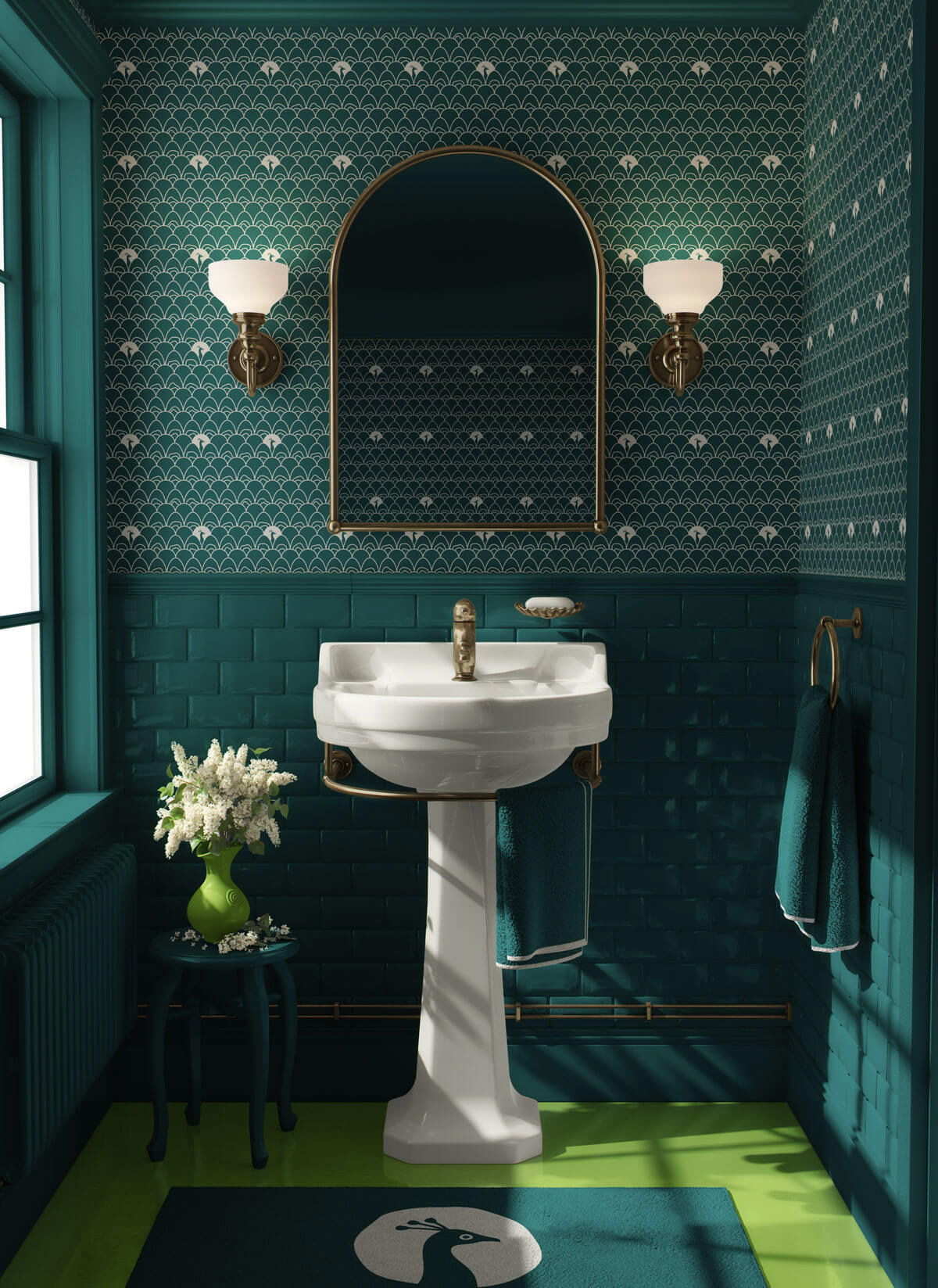
The peacock room is a moody, maximalist escape. Part cocktail lounge, part well-kept secret. Tucked inside a larger bar, it was built to feel like stepping into another world: rich with jewel tones, obnoxious and kitschy personality, and just the right amount of weird. This hospitality branding project captures the unique spirit of a nightlife spot where elegance gets a little wild, and every night feels like a discovery.
The Challenge
Branding The Peacock Room came with a unique challenge: creating a distinct identity for a space tucked inside a larger establishment. It needed to feel separate but connected, with its own personality that was elegant and just a little left of center. The vision was clear—this was no ordinary lounge. The Peacock Room was eccentric, kitschy, and elegantly obnoxious, demanding a brand that could capture its bold charm without feeling forced. It had to walk the line between refined and rebellious, inviting guests into a space that felt like a hidden world waiting to be uncovered.

The Strategy
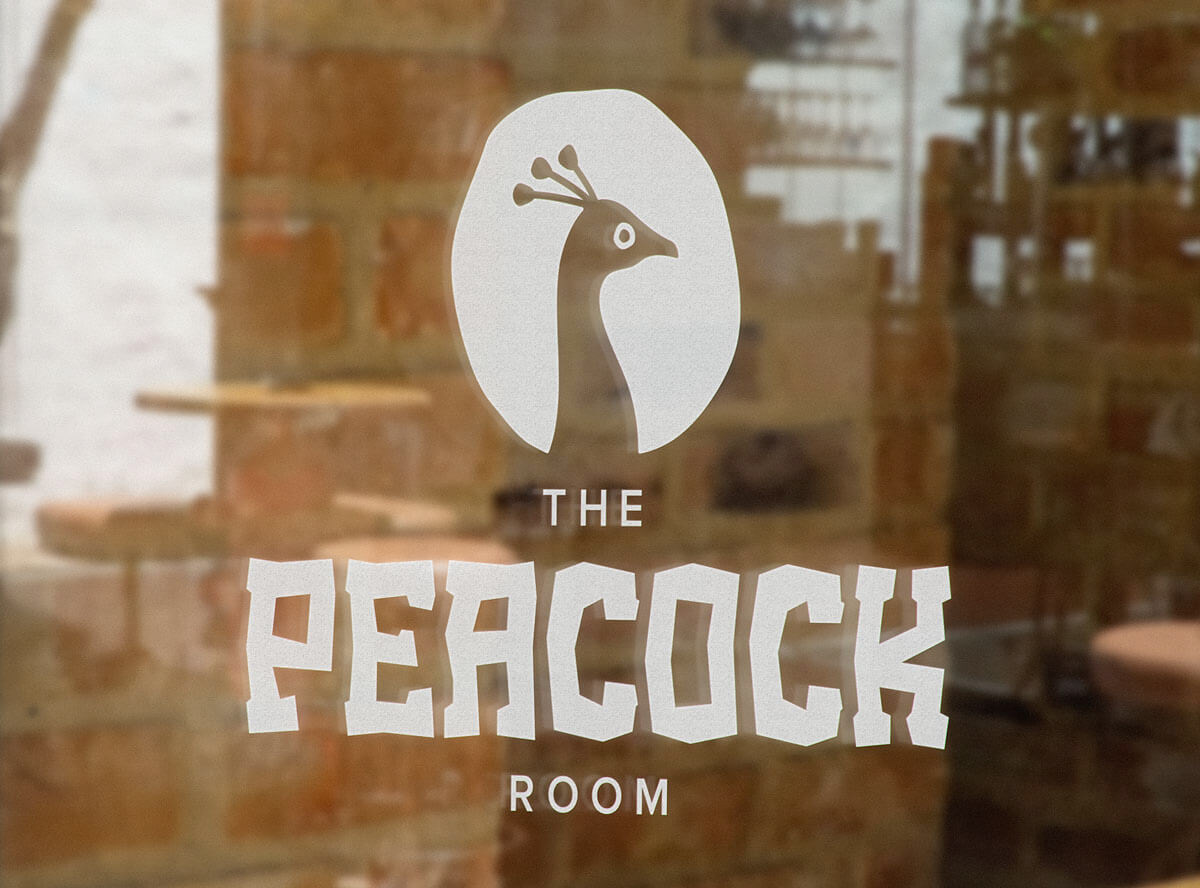
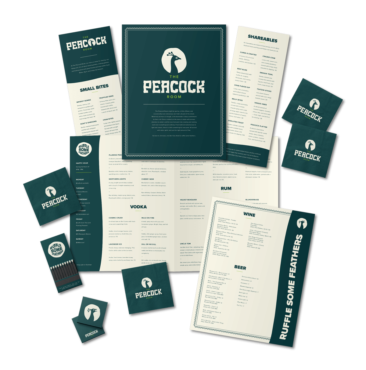
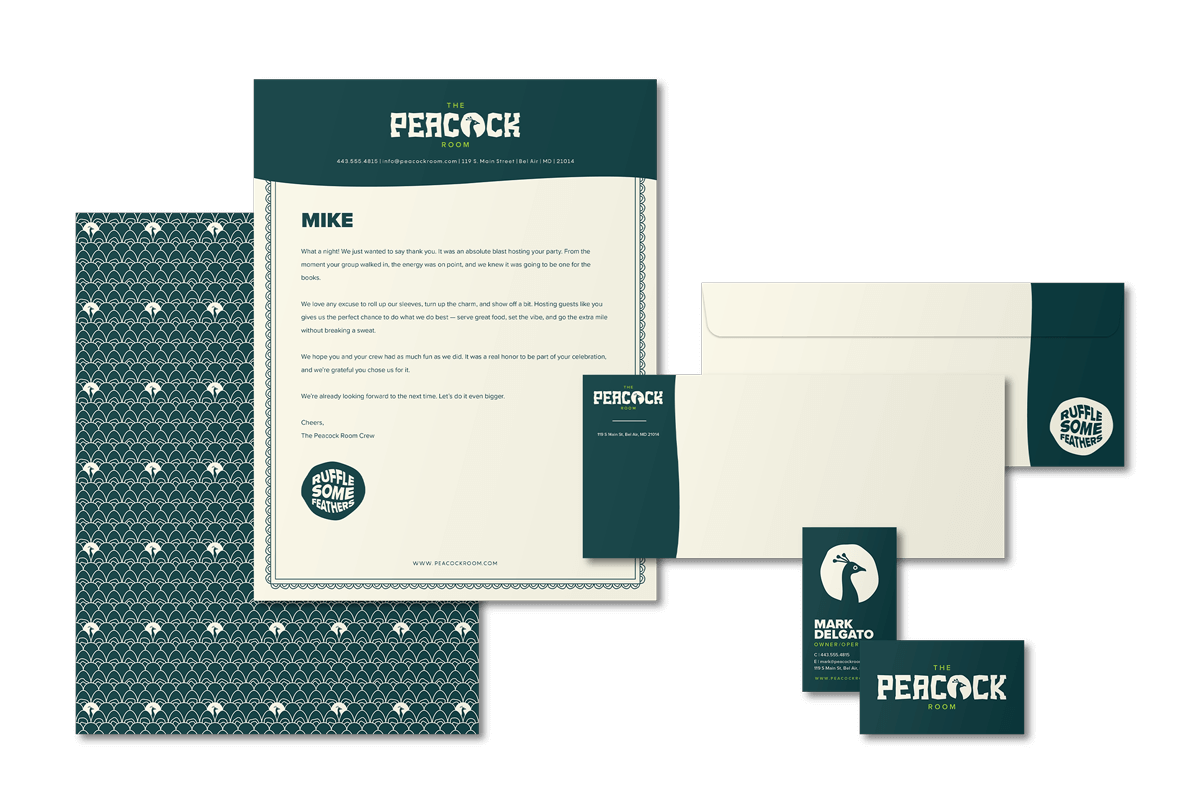
My approach to branding The Peacock Room was all about balancing elegance with eccentricity. The brand mark needed to represent a peacock, but I wanted to avoid the obvious. I chose a subtle silhouette of a peacock’s head to suggest the idea without being literal, capturing the bold yet refined personality of the space. To pair with that, I created a custom wordmark that felt loose, playful, and intentionally offbeat—something that stood out without overpowering the mark. The color palette followed the same logic. Instead of pulling straight from a peacock’s feathers, I chose a vibrant teal and lime green. The contrast between them feels fresh and unexpected, aligning perfectly with the quirky, confident energy of The Peacock Room.

The Outcome
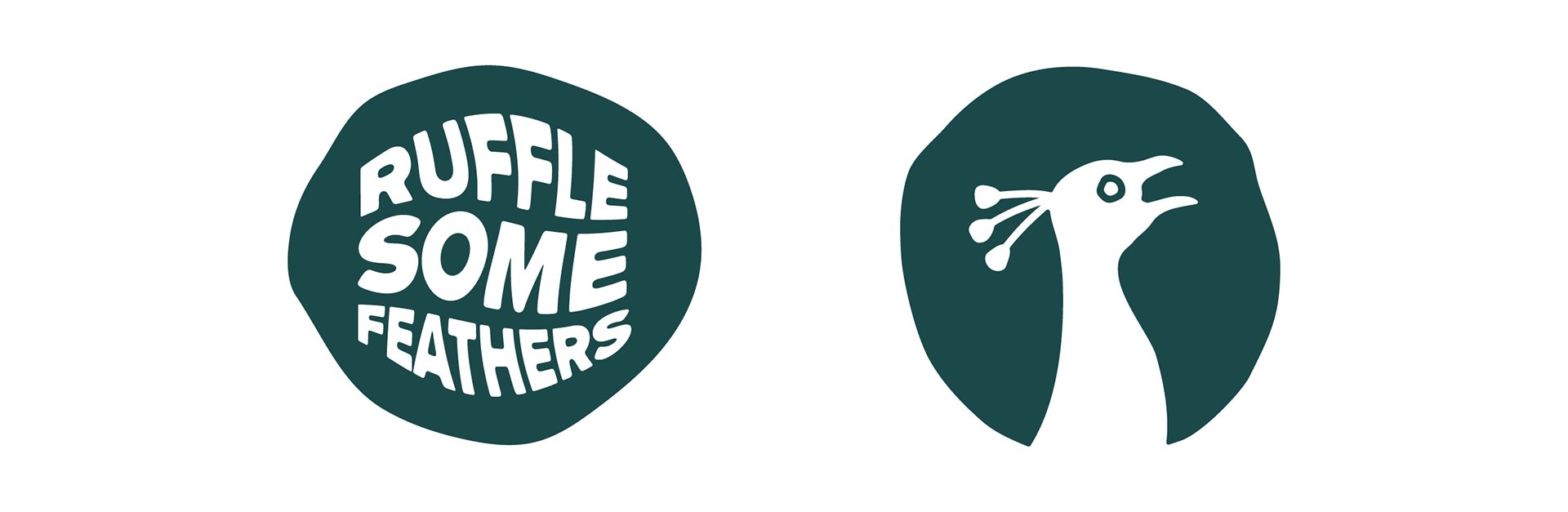
The Peacock Room’s branding and graphic design came alive across every element, seamlessly blending its moody, maximalist vibe with unexpected elegance. From the custom-designed menus and beverage napkins to matchbooks and interior wallpaper, each branded touchpoint reflected the playful yet refined spirit of the logo. The brand’s laid-back slogan, “ruffle some feathers,” perfectly captures its quirky, unapologetic personality, while the squawking peacock brand mark adds a bold, cheeky element prominently featured in marketing materials. This cohesive restaurant branding and visual identity invite guests to step into a world where kitsch meets sophistication, making every visit feel like a stylish, well-kept secret.